Built-in plotting API
Deephaven's built-in plotting API offers methods for creating figures, plots, and charts using data sourced directly from tables. This guide provides an overview of its capabilities.
The built-in plotting API is no longer under active development, and there are no plans for new patches, features, or fixes. Deephaven Express is recommended for most plotting tasks.
This guide covers the following plot types:
- XY series plots
- Category plots
- Category histograms
- Histograms
- Pie charts
- OHLC plots
- Dynamic plots
- Subplots
- Treemaps
XY Series
XY series plots are generally used to show values over a continuum, such as time. They can be represented as a line, a bar, an area, or a collection of points. The X axis shows the domain, while the Y axis shows the related values at specific points in the range.
You can create an XY Series plot using data from Deephaven tables with the following syntax:
.plot_xy("series_name", t, "x", "y").show()
plot_xyis the method used to create an XY series plot."series_name"is the name (as a string) you want to use to identify the series on the plot itself.tis the table that holds the data you want to plot."x"is the name of the column of data to be used for the X value."y"is the name of the column of data to be used for the Y value.showtells Deephaven to draw the plot in the console.
The example query below will create an XY series plot showing Bitcoin's high on September 8, 2021.
from deephaven import read_csv
from deephaven.plot.figure import Figure

# source the data
source = read_csv(
    "https://media.githubusercontent.com/media/deephaven/examples/main/MetricCentury/csv/metriccentury.csv"
)

# plot the data
plot_single = (
    Figure()
    .plot_xy(
        series_name="Distance",
        t=source.where(filters=["SpeedKPH > 0"]),
        x="Time",
        y="DistanceMeters",
    )
    .show()
)
- source
- plot_single
Plot by some key
You may want to create a plot with multiple series grouped by a particular key. This can be accomplished using the by parameter.
An individual XY series is plotted for each unique group in the identifier columns.
from deephaven.plot.figure import Figure
from deephaven import empty_table

multi_source = empty_table(20).update(
    ["Letter = (i % 2 == 0) ? `A` : `B`", "X = 0.1 * i", "Y = randomDouble(0.0, 5.0)"]
)

plot_multi = (
    Figure()
    .plot_xy(series_name="Random numbers", t=multi_source, x="X", y="Y", by=["Letter"])
    .show()
)
- plot_multi
Shared axes
You can compare multiple series over the same period of time by creating an XY series plot with shared axes. In the following example, two series are plotted, thereby creating two line graphs on the same plot.
# plot the data
plot_shared_axis = (
    Figure()
    .plot_xy(series_name="Altitude", t=source, x="Time", y="AltitudeMeters")
    .plot_xy(series_name="Speed", t=source, x="Time", y="SpeedKPH")
    .show()
)
- plot_shared_axis
You can choose to hide one or more series in the plot. Simply click the series name at the right of the plot to hide it; click the name again to restore it.
Subsequent series can be added to the plot by adding additional plot_xy methods to the query.
Multiple X or Y Axes
When plotting multiple series in a single plot, the range of the Y axis is an important factor to watch. As the Y axis range increases, value changes become harder to assess.
When the scale of the Y axis needs to cover an extremely wide range, the plot may result in relatively flat lines with barely distinguishable differences in values or trend.
This issue can be easily remedied by adding a second Y axis to the plot via the x_twin method. x_twin enables you to use one Y axis for some of the series being plotted and a second Y axis for the others, while sharing the same X axis:
PlotName = Figure().plot_xy(...).x_twin().plot_xy(...).show()
- The plot(s) for the series placed before the
x_twin()method share a common Y axis (on the left). - The plot(s) for the series listed after the
x_twin()method share a common Y axis (on the right). - All plots share the same X axis.
plot_shared_twin_x = (
    Figure()
    .plot_xy(series_name="Altitude", t=source, x="Time", y="AltitudeMeters")
    .x_twin()
    .plot_xy(series_name="Speed", t=source, x="Time", y="SpeedKPH")
    .show()
)
- plot_shared_twin_x
The value range for the high value is shown on the left axis and the value range for the low value is shown on the right axis.
The y_twin method enables you to use one X axis for one set of the values being plotted and a second X axis for another, while sharing the same Y axis:
plot_name = Figure().plot_xy(...).y_twin().plot_xy(...).show()
- The plot(s) for the series placed before the
y_twin()method use the lower X axis. - The plot(s) for the series listed after the
y_twin()method use the upper X axis.
Plot colors
It's easy to change the colors of the lines in an XY series plot using the line method. This example modifies the plot above to have red and yellow lines:
plot_shared_twin_x_colors = (
    Figure()
    .plot_xy(series_name="Altitude", t=source, x="Time", y="AltitudeMeters")
    .line(color="RED")
    .x_twin()
    .plot_xy(series_name="Speed", t=source, x="Time", y="SpeedKPH")
    .line(color="YELLOW")
    .show()
)
- plot_shared_twin_x_colors
You can find the full list of available colors here.
Plot styles
The XY series plot in Deephaven defaults to a line plot. However, Deephaven's plot_style method can be used to format XY series plots as area charts, stacked area charts, bar charts, stacked bar charts, scatter charts and step charts.
In any of the examples below, you can simply swap out the plot_style argument with the appropriate name; e.g., ("AREA"), ("STACKED_BAR"), ("LINE"), etc.
XY Series as a stacked area plot
In any of the examples below, you can simply swap out the plot_style argument with the name ("BAR"), ("STACKED_BAR"), ("LINE"), ("AREA"), ("STACKED_AREA"), ("ERROR_BAR"), etc.
from deephaven.plot import PlotStyle

plot_single_stacked_area = (
    Figure()
    .axes(plot_style=PlotStyle.STACKED_AREA)
    .plot_xy(series_name="Heart_rate", t=source, x="Time", y="HeartRate")
    .show()
)
- plot_single_stacked_area
XY Series as a scatter plot
In the example below, a scatter plot style is used. Additionally, x_twin has been specified to for both plots to share the same X axis.
from deephaven.plot.figure import Figure
from deephaven.plot import PlotStyle
from deephaven.plot import Color, Colors
from deephaven.plot import font_family_names, Font, FontStyle, Shape

plot_xy_scatter = (
    Figure()
    .plot_xy(series_name="Speed", t=source, x="Time", y="SpeedKPH")
    .axes(plot_style=PlotStyle.SCATTER)
    .x_twin()
    .plot_xy(series_name="Distance", t=source, x="Time", y="DistanceMeters")
    .axes(plot_style=PlotStyle.SCATTER)
    .show()
)
- plot_xy_scatter
XY Series as a scatter plot with markers
In the example below, the scatter plot includes markers. First, twin method is used to clone the x- and y-axes. Then, the SCATTER PlotStyle is applied to the new axes. The points method draws the plot markers.
from deephaven import time_table
from deephaven.plot.figure import Figure
from deephaven.plot import PlotStyle
from deephaven.plot import Color, Colors
from deephaven.plot import font_family_names, Font, FontStyle, Shape

data = time_table("PT00:00:01").update(
    [
        "Open = 10*sin(0.2*ii) + 2*random()",
        "High = Open + 1",
        "Low = Open - 1",
        "Close = Open + 0.5",
    ]
)

points = data.where("i%5 = 0").view(
    ["Timestamp", "Type= i%3==0 ? `Sell` : `Buy`", "Point = i%3==0 ? High+1 : Low-1"]
)

plot = (
    Figure()
    .figure_title("OHLC + Points")
    .plot_xy(
        series_name="OHLC", t=data, x="Timestamp", y_high="High", y_low="Low", y="Close"
    )
    .twin()
    .axes(plot_style=PlotStyle.SCATTER)
    .plot_xy(series_name="Buy", t=points.where("Type=`Buy`"), x="Timestamp", y="Point")
    .plot_xy(
        series_name="Sell", t=points.where("Type=`Sell`"), x="Timestamp", y="Point"
    )
    .show()
)
XY Series as a step plot
In the example below, the .plot_style argument has the name ("STEP"). Other parameters are defined to show the fine tuning detail under control.
from deephaven.plot import LineEndStyle, LineJoinStyle, LineStyle

plot_step = (
    Figure()
    .axes(plot_style=PlotStyle.STEP)
    .plot_xy(series_name="HeartRate", t=source, x="Time", y="HeartRate")
    .line(style=LineStyle(width=1.0, end_style=LineEndStyle.ROUND))
    .show()
)
- plot_step
Plot multiple series in a loop
It's common in data analysis to have multiple series that share an X-axis. In such a case, a for loop can make things easier for plotting. The following example plots three different series on the same plot in a for loop.
from deephaven.plot.figure import Figure
from deephaven import empty_table

source = empty_table(10).update(
    ["X = i", "Y1 = randomInt(1, 10)", "Y2 = randomInt(3, 11)", "Y3 = randomInt(5, 15)"]
)

fig = Figure()

for idx in range(1, 4):
    fig = fig.plot_xy(series_name=f"Y{idx}", t=source, x="X", y=f"Y{idx}")

plot_loop = fig.show()
- source
- plot_loop
Category
Use the plot_cat method to create category plots, which display data values from different discrete categories.
When data is sourced from a Deephaven table, the following syntax can be used:
.plot_cat(series_name="series_name", t, category="Category", y="Y", y_low="YLow", y_high="YHigh", by=["GroupingColumn"])
plot_catis the method used to create a category plot.series_nameis the name of the series on the plot.tis the name of the table that holds the data you want to plot.categoryis the column in the source table with the category values.yis the column in the source table with the y values.y_lowis a lower y error bar.y_highis a higher y error bar.byis a list of one or more columns that hold grouping data.
from deephaven.column import int_col, string_col
from deephaven.plot.figure import Figure
from deephaven import new_table

source = new_table(
    [string_col("Categories", ["A", "B", "C"]), int_col("Values", [1, 3, 5])]
)

plot_cat = (
    Figure()
    .plot_cat(series_name="Categories", t=source, category="Categories", y="Values")
    .show()
)
- source
- plot_cat
Shared axes
You can also compare multiple categories by creating a category plot with shared axes. In the following example, a second category plot has been added to the previous example, thereby creating bar graphs on the same chart:
from deephaven.plot.figure import Figure
from deephaven.column import int_col, string_col
from deephaven import new_table

source_one = new_table(
    [string_col("Categories", ["A", "B", "C"]), int_col("Values", [1, 3, 5])]
)
source_two = new_table(
    [string_col("Categories", ["A", "B", "C"]), int_col("Values", [2, 4, 6])]
)

cat_shared_axes = (
    Figure()
    .plot_cat(series_name="source_one", t=source_one, category="Categories", y="Values")
    .plot_cat(series_name="source_two", t=source_two, category="Categories", y="Values")
    .show()
)
- cat_shared_axes
- source_one
- source_two
Subsequent categories can be added to the chart by adding additional plot_cat methods to the query.
Plot styles
By default, values are presented as vertical bars. Deephaven's PlotStyle method allows you to use other styles for your plots.
In any of the examples below, you can simply use the PlotStyle class with the appropriate value (e.g., STACKED_BAR, HISTOGRAM, etc.).
Category plot with Stacked Bar
from deephaven.plot import PlotStyle

cat_stacked_bar = (
    Figure()
    .axes(plot_style=PlotStyle.STACKED_BAR)
    .plot_cat(
        series_name="Categories1", t=source_one, category="Categories", y="Values"
    )
    .plot_cat(
        series_name="Categories2", t=source_two, category="Categories", y="Values"
    )
    .show()
)
- cat_stacked_bar
Category histogram
Use the plot_cat_hist method to create category histograms, which show how frequently a set of discrete values (categories) occur.
When data is sourced from a Deephaven table, the following syntax can be used:
.plot_cat_hist(series_name="series_name", t, category="Category").show()
plot_cat_histis the method used to create a category histogram.series_nameis the name (as a string) you want to use to identify the series on the chart itself.tis the table that holds the data you want to plot.categoryis the name of the column (as a string) containing the discrete values.show()tells Deephaven to draw the plot in the console.
from deephaven import new_table
from deephaven.column import int_col
from deephaven.plot.figure import Figure

source = new_table([int_col("Keys", [3, 2, 2, 1, 1, 1])])


plot_cat_hist = (
    Figure()
    .plot_cat_hist(series_name="Category Histogram", t=source, category="Keys")
    .show()
)
- source
- plot_cat_hist
When data is sourced from an array, the following syntax can be used:
.plot_cat_hist(series_name, category).show()
from deephaven.plot.figure import Figure
import numpy as np

values = np.array([3, 2, 2, 1, 1, 1])

plot_cat_hist2 = (
    Figure()
    .plot_cat_hist(series_name="Values", category=list(values))
    .chart_title(title="Count of Values")
    .show()
)
- plot_cat_hist2
Histogram
Use the plot_xy_hist method to create histograms.
The histogram is used to show how frequently different data values occur. The data is divided into logical intervals (or bins) , which are then aggregated and charted with vertical bars. Unlike bar charts (category plots), bars in histograms do not have spaces between them unless there is a gap in the data.
When data is sourced from a table, the following syntax can be used:
.plot_xy_hist(series_name="series_name", t, x="XCol", nbins).show()
plot_xy_histis the method used to create a histogram.series_nameis the name (as a string) you want to use to identify the series on the chart itself.tis the table that holds the data you want to plot.xis the name of the column (as a string) of data to be used for the X values.nbinsis the integer number of intervals to use in the chart.showtells Deephaven to draw the plot in the console.
from deephaven.plot.figure import Figure
from deephaven import new_table
from deephaven.column import int_col

source = new_table([int_col("Values", [1, 2, 2, 3, 3, 3, 4, 4, 5])])

plot_hist = (
    Figure()
    .plot_xy_hist(series_name="Histogram Values", t=source, x="Values", nbins=5)
    .chart_title(title="Histogram of Values")
    .show()
)
- plot_hist
The plot_xy_hist method assumes you want to plot the entire range of values in the dataset. However, you can also set the minimum and maximum values of the range using xmin and xmax respectively:
.plot_xy_hist(series_name, t, x, xmin, xmax, nbins).show()
xminis a floating point minimum value in thexcolumn you want to include in the plot.xmaxis a floating point maximum value in thexcolumn you want to include in the plot.
plot_hist_min_max_values = (
    Figure()
    .plot_xy_hist(
        series_name="Histogram Values",
        t=source,
        x="Values",
        xmin=2.0,
        xmax=4.0,
        nbins=5,
    )
    .chart_title(title="Histogram of Values")
    .show()
)
- plot_hist_min_max_values
The following example plots data sourced from a list of array values:
from deephaven.plot.figure import Figure
from numpy import array

source = array([1, 2, 2, 3, 3, 3, 4, 4, 5])

plot_hist_list = (
    Figure()
    .plot_xy_hist(series_name="Histogram Values", x=list(source), nbins=5)
    .chart_title(title="Histogram of Values")
    .show()
)
- plot_hist_list
OHLC
Use the ohlcPlot method to create Open, High, Low and Close (OHLC) plots. These typically show four prices of a security or commodity per time slice: the open and close of the time slice, and the highest and lowest values reached during the time slice.
This plotting method requires a dataset that includes one column containing the values for the X axis (time), and one column for each of the corresponding four values (open, high, low, close).
When data is sourced from a table, the following syntax can be used:
.plot_ohlc(series_name="series_name", t, x="X", open="Open", high="High",low="Low", close="Close").show()
plot_ohlcis the method used to create an OHLC chart."series_name"is the name (as a string) you want to use to identify the series on the chart itself.sourceis the table that holds the data you want to plot."X"is the name (as a string) of the column to be used for the X axis."Open"is the name of the column (as a string) holding the opening price."High"is the name of the column (as a string) holding the highest price."Low"is the name of the column (as a string) holding the lowest price."Close"is the name of the column (as a string) holding the closing price.showtells Deephaven to draw the plot in the console.
from deephaven.plot.figure import Figure
from deephaven import agg as agg
from deephaven import read_csv


crypto_trades = read_csv(
    "https://media.githubusercontent.com/media/deephaven/examples/main/CryptoCurrencyHistory/CSV/CryptoTrades_20210922.csv"
)


agg_list = [
    agg.last(cols=["CloseTime = Timestamp"]),
    agg.first(cols=["OpenTime = Timestamp"]),
    agg.max_(cols=["High = Price"]),
    agg.min_(cols=["Low = Price"]),
]

btc_bin = crypto_trades.where(filters=["Instrument=`BTC/USD`"]).update(
    formulas=["TimestampBin = lowerBin(Timestamp, MINUTE)"]
)

t_ohlc = (
    btc_bin.agg_by(agg_list, by=["TimestampBin"])
    .join(table=btc_bin, on=["CloseTime = Timestamp"], joins=["Close = Price"])
    .join(table=btc_bin, on=["OpenTime = Timestamp"], joins=["Open = Price"])
)

ohlc_plot = (
    Figure()
    .figure_title("BTC OHLC - Aug 22 2021")
    .plot_ohlc(
        series_name="BTC",
        t=t_ohlc,
        x="TimestampBin",
        open="Open",
        high="High",
        low="Low",
        close="Close",
    )
    .show()
)
- ohlc_plot
- crypto_trades
- btc_bin
- t_ohlc
This query plots the OHLC chart as follows:
ohlc_plotis the name of the variable that will hold the chart.plot_ohlcis the method."BTC"is the name of the series to be used in the chart.t_ohlcis the table from which our data is being pulled.TimestampBinis the name of the column to be used for the X axis."Open","High","Low", and"Close", are the names of the columns containing the four respective data points to be plotted on the Y axis.
Shared axes
Just like XY series plots, the Open, High, Low and Close plot can also be used to present multiple series on the same chart, including the use of multiple X or Y axes. We can build on the previous example:
from deephaven import agg
from deephaven.plot.figure import Figure

btc_bin = crypto_trades.where(filters=["Instrument=`BTC/USD`"]).update(
    formulas=["TimestampBin = lowerBin(Timestamp, MINUTE)"]
)

eth_bin = crypto_trades.where(filters=["Instrument=`ETH/USD`"]).update(
    formulas=["TimestampBin = lowerBin(Timestamp, MINUTE)"]
)

agg_list = [
    agg.last(cols=["CloseTime = Timestamp"]),
    agg.first(cols=["OpenTime = Timestamp"]),
    agg.max_(["High = Price"]),
    agg.min_(["Low = Price"]),
]

btc_ohlc = (
    btc_bin.agg_by(agg_list, by=["TimestampBin"])
    .join(table=btc_bin, on=["CloseTime = Timestamp"], joins=["Close = Price"])
    .join(table=btc_bin, on=["OpenTime = Timestamp"], joins=["Open = Price"])
)

eth_ohlc = (
    eth_bin.agg_by(agg_list, by=["TimestampBin"])
    .join(table=eth_bin, on=["CloseTime = Timestamp"], joins=["Close = Price"])
    .join(table=eth_bin, on=["OpenTime = Timestamp"], joins=["Open = Price"])
)

ohlc_plot = (
    Figure()
    .figure_title("BTC and ETC OHLC - Aug 22 2021")
    .plot_ohlc(
        series_name="BTC",
        t=btc_ohlc,
        x="TimestampBin",
        open="Open",
        high="High",
        low="Low",
        close="Close",
    )
    .x_twin()
    .plot_ohlc(
        series_name="ETH",
        t=eth_ohlc,
        x="TimestampBin",
        open="Open",
        high="High",
        low="Low",
        close="Close",
    )
    .show()
)
- btc_bin
- eth_bin
- btc_ohlc
- eth_ohlc
- ohlc_plot
This query plots the OHLC chart as follows:
ohlc_plotis the name of the variable that will hold the chart.plot_ohlcplots the first series."BTC"is the name of the first series to be used in the chart.btc_ohlcis the table from which the data is being pulled.where("Instrument=`BTC/USD`")filters the table to only the AAPL Ticker.TimestampBinis the name of the column to be used for the X axis."Open","High", "Low", and"Close", are the names of the columns containing the four respective data points to be plotted on the Y axis.
x_twinis used to show different Y axes.plot_ohlcplots the second series."ETH"is the name of the second series to be used in the chart.eth_ohlcis the table from which the data is being pulled.where("Instrument=`ETH/USD`")filters the table to only the MSFT Ticker.TimestampBinis the name of the column to be used for the X axis."Open","High","Low", and"Close", are the names of the columns containing the four respective data points to be plotted on the Y axis.
figure_title()provides the title for the chart.
In this plot, the opening, high, low and closing price of BTC and ETH are plotted. The x_twin method is used to show the value scale for BTC on the left Y axis and the value scale for ETH on the right Y axis.
Pie
Use the plot_pie method to create pie charts, which show data as sections of a circle to represent the relative proportion for each of the categories that make up the entire dataset being plotted.
When data is sourced from a table, the following syntax can be used to create a pie plot:
from deephaven.plot.figure import Figure

new_fig = (
    Figure()
    .plot_pie(
        series_name="Series", t=source_table, category="CategoryColumn", y="ValueColumn"
    )
    .show()
)
Figureis the class in which pie plotting functionalities live.new_figis a pie plot created with theplot_piemethod.series_nameis the name that will be displayed on the plot.tis the table in which data will be sourced from.categoryis the name of the column which holds the categories to place in the pie chart. If you want to source data from an array, this may be a list containing the data to be used for the categories.yis the name of the column in which the values for each category exist.showtells Deephaven to draw the plot in the console.
from deephaven.plot.figure import Figure
from deephaven import read_csv

insurance = read_csv(
    "https://media.githubusercontent.com/media/deephaven/examples/main/Insurance/csv/insurance.csv"
)
insurance_by_region = insurance.view(formulas=["region", "expenses"]).sum_by(["region"])

plot_pie = (
    Figure()
    .plot_pie(
        series_name="Insurance charges by region",
        t=insurance_by_region,
        category="region",
        y="expenses",
    )
    .show()
)
- plot_pie
- insurance
- insurance_by_region
Dynamic plots
Plots configured with a SelectableDataSet can be paired with Deephaven's Input Filter, Linker feature, or drop-down filters. As the input changes, the paired plot will dynamically update to reflect the filtered dataset.
one_click
To create a dynamically updating plot - a plot that updates with "one click" in the console -, the data source must be a SelectableDataSet. This is easily accomplished with the use of the one_click method:
one_click(t: Table, by: list[str] = None, require_all_filters: bool = False) -> SelectableDataSet
tis the table containing the data.- A list of strings, where each string is the name of a column to be made available for input filtering.
require_all_filters, when set toTrue, will display a prompt explaining that filter controls must be added to the resulting plot. By default (False), this message will not be displayed.
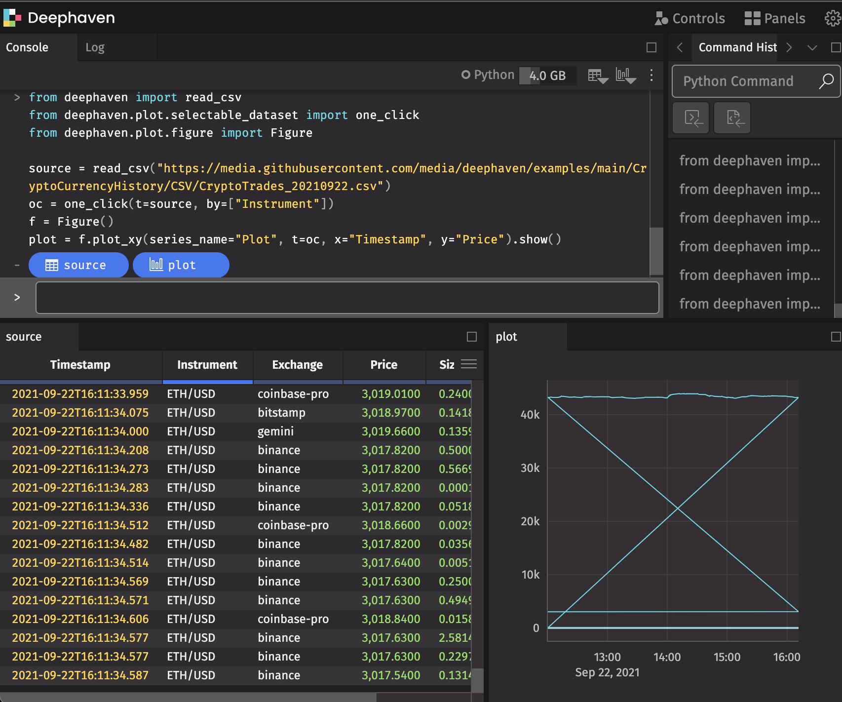
from deephaven import read_csv
from deephaven.plot.selectable_dataset import one_click
from deephaven.plot.figure import Figure

source = read_csv(
    "https://media.githubusercontent.com/media/deephaven/examples/main/CryptoCurrencyHistory/CSV/CryptoTrades_20210922.csv"
)
oc = one_click(t=source, by=["Instrument"])
plot = Figure().plot_xy(series_name="Plot", t=oc, x="Timestamp", y="Price").show()
Input Filters
To pair your dynamic plot with an Input Filter, navigate to Input Filter in the Controls menu in the upper right-hand corner of the UI, or select Add Input Filters in the console.

The Input Filter feature filters every open table and dynamic plot in the console.
Linker Tool
Alternatively, you can use the Linker tool to pair the dynamic plot with a table by clicking the Open Linker Tool button in the console or choosing the Linker option from the Controls menu.
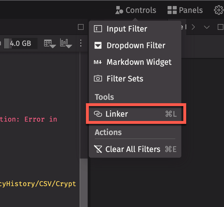

Connect the input column button in the dynamic plot to the matching column in the trigger table. Double-clicking on any row in the trigger table will filter the target (the dynamic plot) to match the input column's value in that row.
Subplots
The deephaven.plot method can create subplots within figures. Subplots are plots that are displayed together in a single figure, placed in a grid based on row and column numbers. While a single plot with multiple series places the lines, bars, scatters, etc on the same axes, subplots are placed in different sections of a single figure. Typically, subplots are used when the data is distinctly different from one another, or when you do not need to actively compare two sets of data with one another.
Define subplots
Set the number of subplots when you create a Figure. The input names are rows and columns.
from deephaven.plot.figure import Figure

f = Figure(rows=n, cols=m)
n and m are the number of rows and columns, respectively.
Add subplots to a figure
The syntax for a single plot on a single figure is as follows:
from deephaven.plot.figure import Figure
from deephaven import empty_table

source = empty_table(100).update(["X = i", "Y = cos(0.1 * i)"])

f = Figure().plot_xy(series_name="Cosine", t=source, x="X", y="Y").show()
- source
- f
For a single figure with only one plot, specifying rows and columns is optional. However, if a plot has more than one subplot, these arguments are required. After defining the figure and its subplots, you must specify each subplot with a new_chart call. Each new_chart call creates a chart at a given row and column in the figure.
For instance, if you wish to have two subplots, one on top of another, a figure needs two rows and one column.
from deephaven.plot.figure import Figure
from deephaven import empty_table

source = empty_table(100).update(["X = i", "Y = cos(0.1 * i)", "Z = sin(0.1 * i)"])

f = (
    Figure(rows=2, cols=1)
    .new_chart(row=0, col=0)
    .plot_xy(series_name="Y", t=source, x="X", y="Y")
    .new_chart(row=1, col=0)
    .plot_xy(series_name="Z", t=source, x="X", y="Z")
    .show()
)
- source
- f
One row, two columns
Let's instead create a figure with two columns and one row. The series Y appears on the left, and Z on the right.
f = (
    Figure(rows=1, cols=2)
    .new_chart(row=0, col=0)
    .plot_xy(series_name="Y", t=source, x="X", y="Y")
    .new_chart(row=0, col=1)
    .plot_xy(series_name="Z", t=source, x="X", y="Z")
    .show()
)
- f
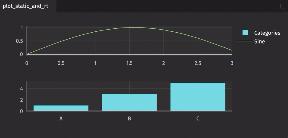
Different plot types
A single figure can handle multiple plot types as well as both static and real-time data.
from deephaven.column import int_col, string_col
from deephaven import empty_table
from deephaven import time_table
from deephaven import new_table
from deephaven.plot.figure import Figure

t1 = time_table("PT0.1S").update_view(["X = 0.1 * i", "Y = sin(X)"])

t2 = new_table(
    [string_col("Categories", ["A", "B", "C"]), int_col("Values", [1, 3, 5])]
)

plot_static_and_rt = (
    Figure(rows=2, cols=1)
    .new_chart(row=0, col=0)
    .plot_cat(series_name="Categories", t=t2, category="Categories", y="Values")
    .new_chart(row=1, col=0)
    .plot_xy(series_name="Sine", t=t1, x="X", y="Y")
    .show()
)
Treemaps
Use the plot_treemap method to create treemap charts, which show data in a hierarchical view where each element takes up a proportional amount based on its value.
From a formatted table
Your table may already be formatted in the structure plot_treemap requires. At a minimum, you need to include the item IDs and parents for the structure of the treemap. When data is already structured in the source table (i.e. all parents are defined with a specific root) sourced from a table, the following syntax can be used to create a treemap plot:
from deephaven import read_csv
from deephaven.plot.figure import Figure

# source the data
source = read_csv(
    "https://media.githubusercontent.com/media/deephaven/examples/main/StandardAndPoors500Financials/csv/s_and_p_500_market_cap.csv"
)

# plot the data
s_and_p = (
    Figure()
    .plot_treemap(
        series_name="S&P 500 Companies by Sector", t=source, id="Label", parent="Parent"
    )
    .show()
)
- s_and_p
- source
You can interact with this plot by clicking on the group headers and cells. Clicking on a header will expand that group; clicking again reverts to the full view. Clicking on an individual cell expands its contents.
s_and_pis a treemap plot created with theplot_treemapmethod.Figureis the class in which treemap plotting functionalities live.series_nameis the name that will be displayed on the plot.tis the table in which data will be sourced from.idis the name of the column which holds the item IDs to use in structuring the treemap chart.parentis the name of the column which holds the parent IDs each item is under to use in the treemap chart. There should only be one root.showtells Deephaven to draw the plot in the console.
By default, the colors selected for each section are selected from a default theme, and the label is simply the ID displayed.
You can provide other parameters to display more information:
from deephaven import read_csv
from deephaven.plot.figure import Figure

# source the data
source = read_csv(
    "https://media.githubusercontent.com/media/deephaven/examples/main/StandardAndPoors500Financials/csv/s_and_p_500_market_cap.csv"
)

# plot the data
s_and_p_marketcap = (
    Figure()
    .plot_treemap(
        series_name="S&P 500 Market Cap",
        t=source,
        id="Label",
        parent="Parent",
        label="Label",
        value="Value",
        hover_text="HoverText",
        color="Color",
    )
    .show()
)
- s_and_p_marketcap
- source
s_and_p_marketcapis a treemap plot created with theplot_treemapmethod.labelis the label to use as display text instead of the raw ID.valueis how large the sector should be compared to other sectors.hover_textis the text to display when hovering over a sector.coloris the color to use for the sector.
From raw data table
Sometimes when you pull data, it may not have the parent/child relationships defined. You can use Deephaven functions to format the table correctly:
from deephaven import read_csv, merge
from deephaven.plot.figure import Figure

# Source the data
source = read_csv(
    "https://media.githubusercontent.com/media/deephaven/examples/main/StandardAndPoors500Financials/csv/s_and_p_500_companies_financials.csv"
)

# Get a view of just the data we need
financials = source.view(["Symbol", "Name", "Sector", "MarketCap=Market_Cap"])

# Find the distinct sectors defined in the data
sectors = financials.select_distinct(["Sector"]).sort(["Sector"])

# Define `root` as the top parent, use sectors as the first level of children
sector_items = sectors.view(
    [
        "Parent=`root`",
        "Label=Sector",
        "Value=(long)0",
        "Color=`#373438`",
        "HoverText=Sector",
    ]
)


# Define our heat map function that will provide a color based on the percent change provided
def heatmap_daily_perc(perc):
    if perc < -0.02:
        return "#f95d84"
    if perc < -0.01:
        return "#f37e3f"
    if perc > 0.01:
        return "#9edc6f"
    return "#fcd65b"


# Update our data with random percent changes for display purposes
stock_items = financials.update(
    ["Perc=randomGaussian(0, 2)/100.0", "PercLabel=String.format(`%.1f%%`, Perc*100)"]
).view(
    [
        "Parent=Sector",
        "Label=Symbol",
        "Value=(long)MarketCap",
        "Color=(String)heatmap_daily_perc(Perc)",
        "HoverText=Name + `: ` + PercLabel",
    ]
)

# Merge the topmost sectors with the rest of the stock items
items = merge([sector_items, stock_items])

# Plot the data
s_and_p_treemap = (
    Figure()
    .plot_treemap(
        series_name="S&P 500 Daily Change",
        t=items,
        id="Label",
        parent="Parent",
        label="Label",
        value="Value",
        hover_text="HoverText",
        color="Color",
    )
    .show()
)
- s_and_p_treemap
- source
- financials
- sectors
- sector_items
- stock_items
- items
financialsis the source table with the raw data.sectorsis a table of the top-level distinct sectors in the raw data.sector_itemsis a table of the top-level sectors with label and color information associated with them.heatmap_daily_percis a function that returns a color based on the percent change provided.stock_itemsis a table with all the stock items and their associated labels.s_and_p_treemapis a treemap plot created with theplot_treemapmethod.